Timeless Colour Combinations We Love

We recently announced the introduction of our very own paint colour range – Herringbone Paints. - featuring a total of 18 timeless colour choices, exclusively available to our clients. Each name has therefore been carefully chosen and means something special to them, a few examples include:
Planted Tree Green: A colour to represent the tree that is planted for every kitchen we make.
Parade Pink: To show our love for Pride Canterbruy and continued sponsorship.
Cliff White: Just up the road from the studio are the world famous White Cliffs of Dover.
Drum Belt Red: Inspired by the drum belts that sand the kitchens before paint.

Timeless Colour Combinations
When it comes to picking the colour for your kitchen, utility, pantry or furniture it can be difficult to picture what it will look like in real life. The designers at Herringbone are always ready to explain the best colour combinations that will suit your personality.
Here are a few suggestions of which colours go perfectly together in a timeless manner.

Pale pink and yellow: this is one of our favourite colour combinations, not only is it fresh and vibrant but it also puts a smile on your face. The colour combination is gentle and bright whilst also trendy and unique
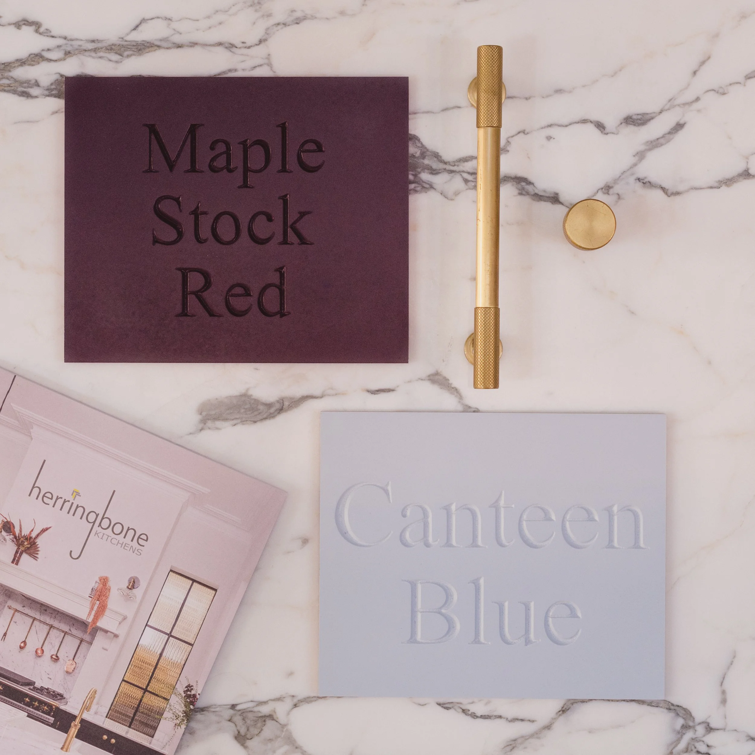
Dark purples and blue pastels: the dark with the light is a lovely combination that brings a pop of colour that is evened out by the lighter calming pastels. It adds interest whilst keeping the space light and airy

Mix of pastel greens: earthy pastel tones are calming and warm. Light and pastel greens are known to be a very soothing, tranquil colour combination and it is a great one to use in a space with back garden windows and French doors, bringing the outside in.
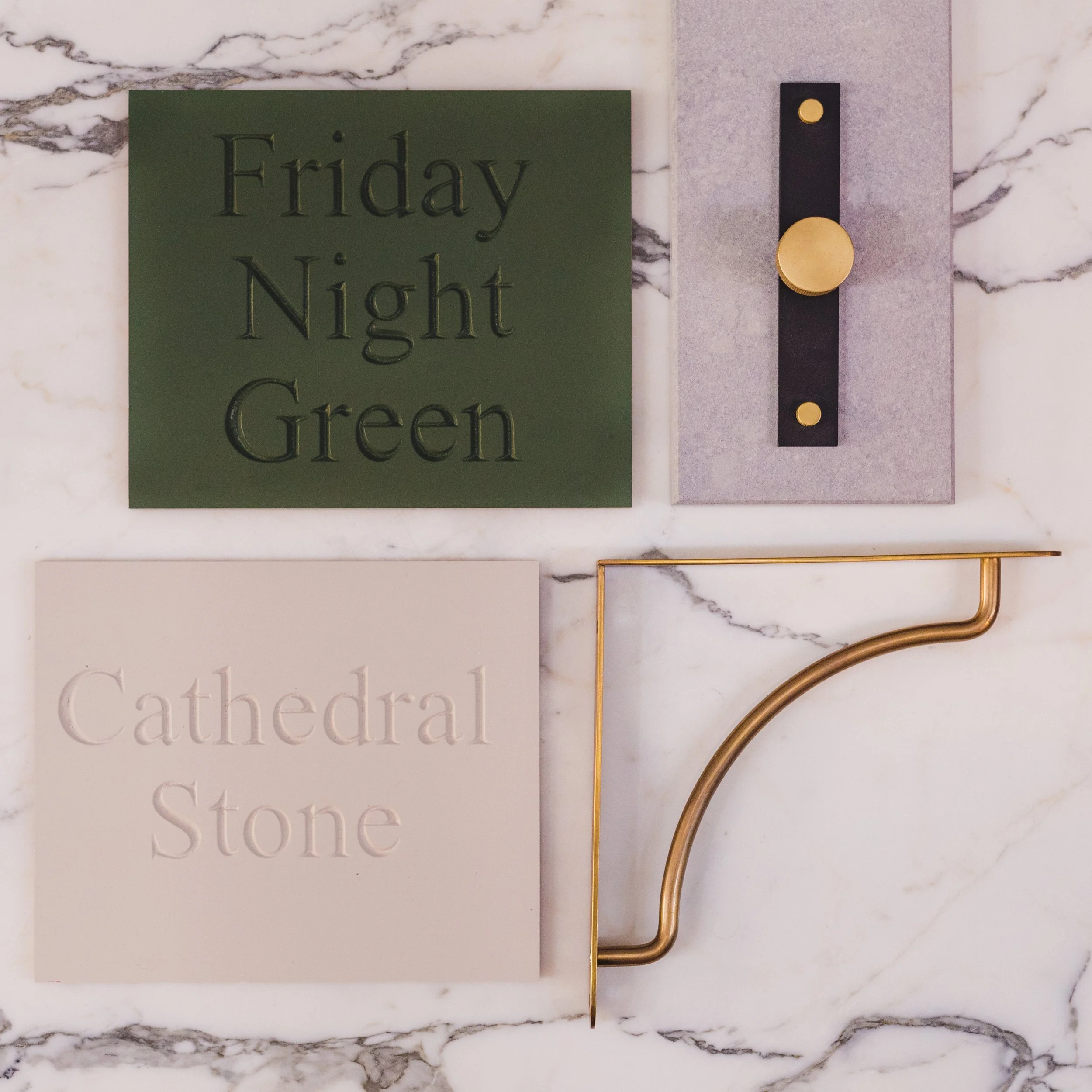
Dark green with white: whether this is your worktop or your island dark green and an off white always go well together. A contrast colour adds interest and create a brighter space, it’s all about getting the perfect match.

Dark reds and pastels: the dark with the light is a lovely combination that brings a pop of colour that is evened out by the lighter calming pastels. It adds interest whilst keeping the space light and airy